53_Chris Webber
  95_Shaquille O'Neal
  270_Reggie Miller
 41_Muggsy Bogues
 46_Terrell Brandon
  76_Bobby Phills
  285_Wayman Tisdale
 53_Chris Webber 95_Shaquille O'Neal 270_Reggie Miller41_Muggsy Bogues46_Terrell Brandon 76_Bobby Phills 285_Wayman Tisdale
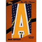
This bothers me about the new products. On some of the earlier Panini stuff, they used different pictures on the back. Then they started using the same photo as the front. Then it became a team logo with some sort of a write up. Now in a lot of cases, it's just a team logo. There are some cards with no write up at all (and my guess is AI is probably doing some of the write ups we do get).AbraCalabro wrote: ↑Sat Jun 08, 2024 12:07 pm
Saw the recent Kemp one and oof............awful photo. Also, no photography on the back. Another bummer.
lol I wouldn't doubt it, it's a shame they're so damn lazy and that they overdo their winning products with parallels, one or two...hell, even three, FINE...but EVERYTHING has 20 parallels or more, everything has a 1/1 and as you mentioned the card backs have been in decline. It doesn't take much effort, but they cut every corner they can. I've also been turned off of a lot of their GU stuff because there's no real guarantee that it was game worn by that player, i.e. manufactured number 88 jerseys. I digress.Deadshot wrote: ↑Mon Jun 10, 2024 1:53 pmThis bothers me about the new products. One some of the earlier Panini stuff, they used different pictures on the back. Then they started using the same photo as the front. Then it became a team logo with some sort of a write up. Now in a lot of cases, it's just a team logo. There are some cards with no write up at all (and my guess is AI is probably doing some of the write ups we do get).AbraCalabro wrote: ↑Sat Jun 08, 2024 12:07 pm
Saw the recent Kemp one and oof............awful photo. Also, no photography on the back. Another bummer.

Damn, now that's what I'm talking about. Superb photography, especially on Paul Pierce, amazing stuff!!!Hondo wrote: ↑Sat Sep 28, 2024 7:42 am https://flic.kr/p/2qjeq3Z
https://flic.kr/p/2qj8avc
https://flic.kr/p/2qjcHWF
https://flic.kr/p/2qjepL1
https://flic.kr/p/2qjeq1E
https://flic.kr/p/2qje1fH
Some poverty versions of 95/96 Upper Deck pick-ups!
I've been enjoying picking these up for the binder and i have to say, they choose some nice images for the Celtics.
One of my favorites from the line also, they got such a great snap shot of him for the base. MJ's second best card from that set for me is the Slams and Jams, but tough to top card number 23!!!